Bombay Duck Designs’ book on Indian design revels in the chaos of ‘Everyday India’

Walking down the streets of any Indian city is a multisensory experience. The relentless traffic, the multiple roadside stalls, the thela walas (cart pullers), and the local shops selling sundry paraphernalia adding a mix of visual, auditory, and aromatic signals to take in. The passage of time marked by the intricately painted hoardings by unknown artists, slightly peeling with age. Surprisingly, one comes to find that almost every city in the subcontinent feels the same. Each a tapestry of yellows and reds and blues. The everyday India is anything but mundane. These material signs, the banners that populate each nukkad (street corner), be it for a soap brand or a political rally, reveal the multiplicities of a place, yet instill a sense of belonging and oneness in us, a sense of home. This visual language is representative of the country’s multiculturalism.
Celebrating and dedicated to the “graphic designers of India, who are at it, every day,” Indian artists/designers Sameer Kulavoor and Zeenat Kulavoor of Bombay Duck Designs were invited to curate an exhibition by designer-curator Srila Chatterjee for Gallery 47-A in Mumbai. Taking inspiration from the seeming chaos of everyday, and in an attempt to reveal and pay homage to the design/art we experience daily, the project involved the documentation of storefronts, signage, and various packaging designs found ubiquitously in the local kirana (grocery) stores. As Chatterjee emphasises on the design showcase, “From signage to products to logos to packaging, growing up in India has given us a whole unique language of design that has become a part of our DNA, that becomes a trigger to stories that encompass every part of our lives. This show is special for us because of the research and development that went into it, and that it has become more than just a show.” The exhibition has now been turned into a book, titled Everyday India, extending its reach and underscoring the Indian design duo’s ongoing fascination with how everyday design makes the country tick.
The book, which is a ‘collection of iconic, nostalgic, familiar, unfamiliar, accidental and intentional graphic design,’ invites its readers to pay closer attention to their surroundings. Looking at design beyond Photoshop files and jpegs, it trains its eye on the ‘spillage of graphic art and designs onto the streets, where the formal and informal meet.’ Part nostalgia, part fantasy, part intense documentation and curation, the volume bound in plain grey with blue embossed typeface holds wonders within. Not just that, a reader is given the chance to design their own covers, with the help of stickers provided with the publication. Essays by Anusha Narayanan, Kaiwan Mehta, Kay Khoo, and Khorshed Deboo add a critical dimension, by elaborating on changing contexts of urbanity within which these designs sit. They highlight the dynamic intersections between the political and the mundane, the lived-in and the nascent, how larger histories are made up of everyday occurrences, and how we can trace our socio-economic realities in something like a packet of crisps. The book asks: What does ‘Indian’ connote in design? How does the Indian identity of design awaken our collective consciousness? Are there similarities in the design of certain objects in India?
On the closing of the exhibition and launch of the book, STIR had the pleasure of speaking to Zeenat Kulavoor, one half of the sibling duo behind Bombay Duck, about curating the show, the importance of highlighting the every day and the many, many instances of design/art we witness on our streets.
-
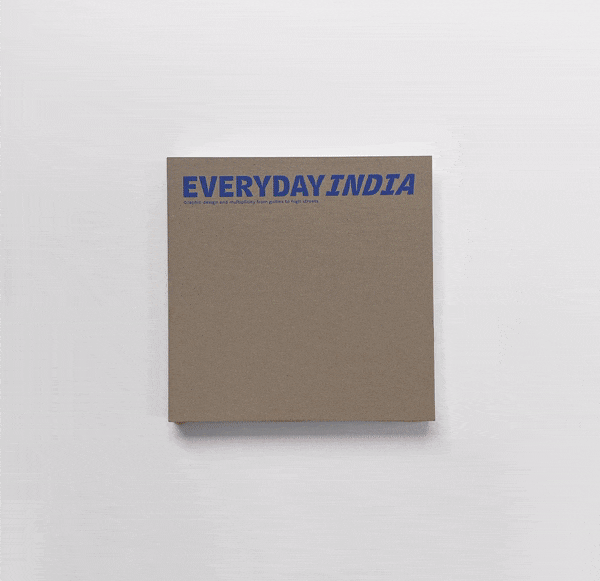
The bound volume comes with a do-it-yourself cover, adding a whimsical element to its experience Image: Courtesy of Bombay Duck Designs
-
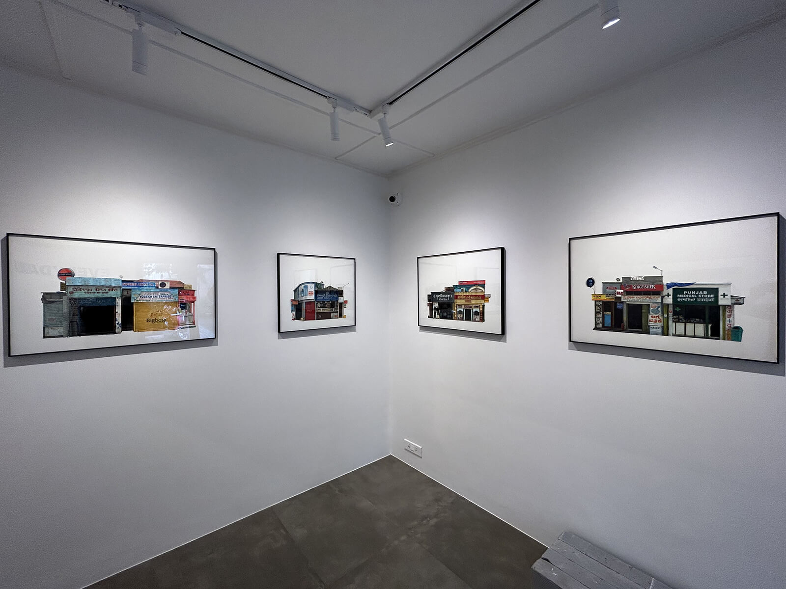
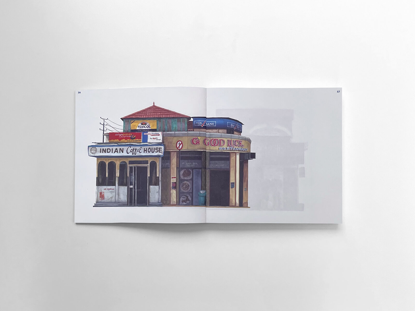
The various storefront illustrations that were displayed in the gallery, which have been reproduced in the publication Image: Courtesy of Bombay Duck Designs
STIR: Why, according to you, is it important to celebrate and document the formal and informal signages and logos that often go unnoticed in our daily lives, as exemplified in the book Everyday India?
Zeenat Kulavoor: In a rapidly evolving India, where nationalistic trends and the internet are driving standardisation, it becomes crucial to celebrate and document the often overlooked formal and informal graphic design that reflects our nation’s diversity and multiculturalism. Our practice as a studio (Bombay Duck Designs) and as individual artists (Sameer and me) often brings out these observations and documents them to some extent. Everyday India—both the exhibit and the book—represent focused research, offering an illustrated documentation of multiplicity in the Indian graphic art/design landscape. It is a collection of observations, both panoptic and meticulous, that looks at design beyond the confines of ‘file dimensions’. Instead, it focuses on the spillage of ‘graphic design’ onto the streets—a place where the formal and informal meet. It is also an enquiry into where design ends and art begins and vice versa and the overlaps between the two.
STIR: In what ways does this book aim to shift our perspective on the diverse forms, sizes, and colours in Indian graphic design, moving beyond the initial perceptions of chaotic clusters?
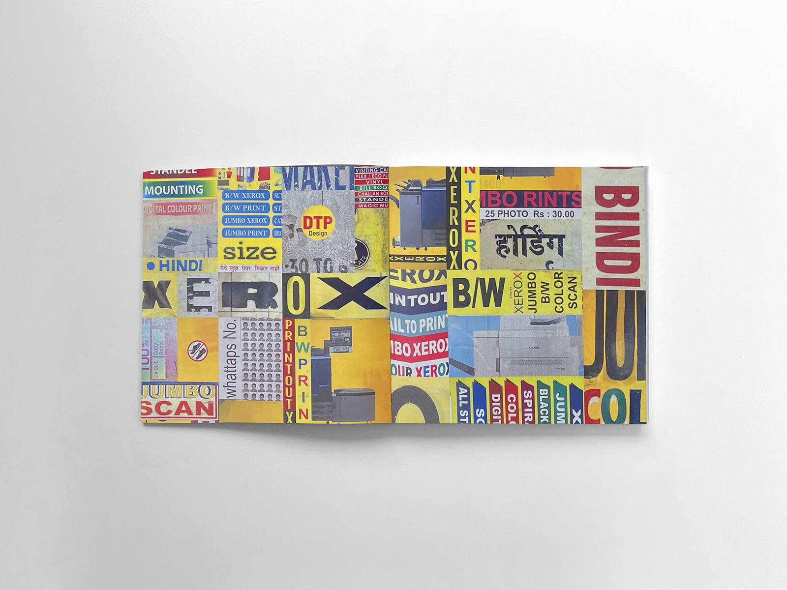
Zeenat: This project serves as an exploration of what defines Indian graphic design. While some may initially perceive it as chaotic clusters, it’s in fact, an organically formed, intricate visual language. Take, for instance, the ‘Storefronts and Signages’ section, which portrays an urban landscape composed of elements from various parts of the country. A pharmacy from Punjab stands next to a print shop from Mysore, all part of a building with art deco details. At first glance, it may seem dissonant, but upon deeper examination, it reveals a unique, fictional vista. These storefronts epitomise the convergence of formal and informal design, where multiple ‘brand guides’ create a distinctive visual identity.
Each section within the book aims to dismantle the notion of chaos, shedding light on often overlooked details. It encourages viewers to perceive their surroundings in a fresh and enlightening way.
STIR: What design philosophies and principles have influenced the compilation of the book that can offer a fresh perspective to a global audience?
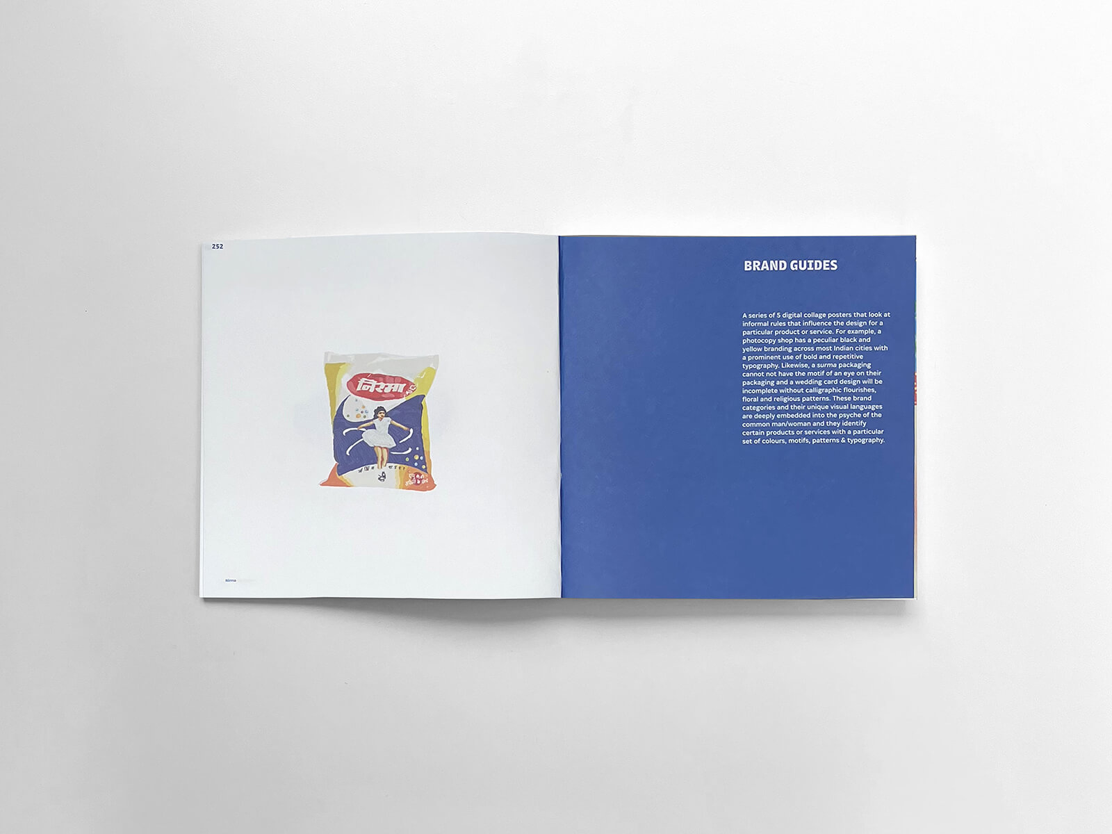
Zeenat: Through the book, we sought to uncover the unspoken guidelines and visual languages that govern various aspects of design in the country. Consider the ‘Brand Guides’ section. During our research, we discovered that certain products or services adhere to unwritten rules. Take surma (kohl) and mehendi packaging, for example; every surma package features an eye to signify its content, and mehendi packets consistently display the face of a bride. The colour palette often consists of primary colours or shiny materials, making these products stand out on shelves or counters. These rules weren’t formally established, yet every surma and mehendi packaging follows them. Similarly, photocopy shops exhibit a striking similarity: they use yellow and black branding, employ large typographical units, and prominently display a menu of their services on the walls.
These shared design elements create a fascinating phenomenon where consumers, knowingly or unknowingly, seek out familiar visual cues when looking for these products or services. This project offers a fresh perspective to a global audience by unveiling these subtle yet pervasive design principles that shape everyday life in India.
STIR: If you had to define the current Indian street landscape in one word, what would it be and why?
Zeenat: A chronicle.
The average streetscape serves as a chronicle, inviting observers to decode its rich narrative. Any street landscape reveals a wealth of information about a place: its history, demographics, and development. The products and services available reflect the local demographics and spending capacity. Signages and shop interiors reflect the area’s development. The transformation of a kirana (grocery) shop into a supermarket tells a story of generational shifts in family businesses. From hand-painted signs to shiny acrylic 3D lettering, you can gauge the age of the establishment. The scripts used on signage reflect the cultural tapestry of the area. For example, in a city like Mumbai, you may encounter signages in various South Indian scripts in neighborhoods like Matunga.
The average streetscape serves as a chronicle, inviting observers to decode its rich narrative. Any street landscape reveals a wealth of information about a place: its history, demographics, and, development.
STIR: In what ways do meticulous considerations such as colour gradients, font sizes, and shapes impact a product’s packaging and its appeal to specific customer segments? Additionally, could you give an example?
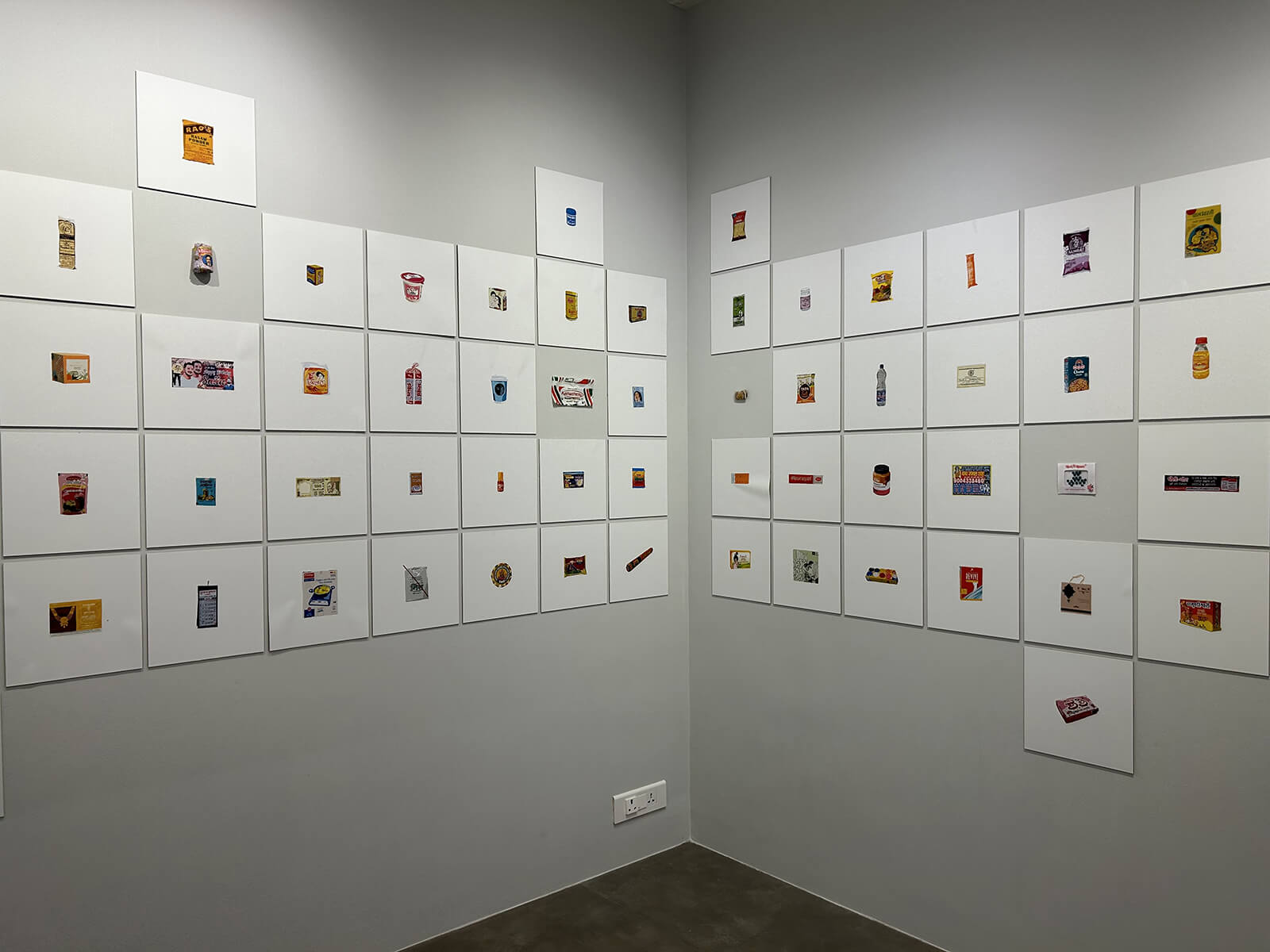
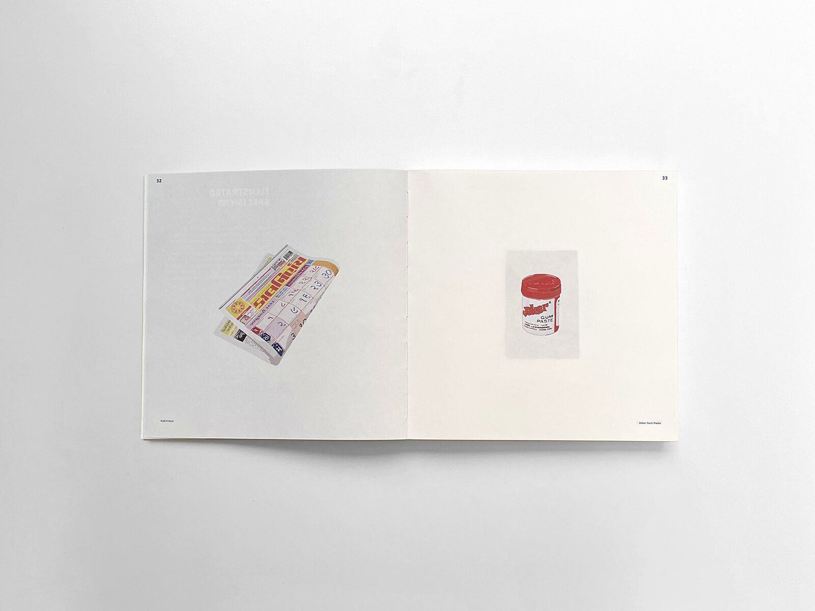
Zeenat: In the section ‘Illustrated Specimens’ we researched, documented and digitally painted over 300 Indian graphic design specimens. This particular specimen and the story behind it will answer your question well. We documented a surma packet called Bhimseni Surma. With the help of our friend Pankhuri Upadhyay, we were lucky enough to talk to the current owner of the brand. Here’s what Vipin Kumar, third generation owner of Bhimseni Karyalaya (Bhimseni Factory), a Varanasi-based manufacturer of products like kajal, surma, camphor and oils, since 1947, had to say about the design of his product:
“Our packaging has been the same since 1947. Our grandfather designed it, along with an artist friend of his. The logo features a banana tree because all of our products make use of bananas. Since then, the only change we have made is making the packaging more colourful. In the past, colour printing was more inaccessible than it is now; hence we used only two colours. However, people’s tastes change with the times, and we have to change with them. Nothing about our packages has been altered in the local markets—in small towns and villages in eastern UP—because that’s how everyone recognises our brand. But we got a review on Amazon once saying that the packaging looks old-fashioned, so we had to update it. The design was the same, just more vibrant. It’s the boldness that sells these days!”
STIR: What role do informal landmarks like signages/storefronts play in providing effective directions, as compared to conventional street names?
Zeenat: In the Indian wayfinding system, informal landmarks such as signages and storefronts play a pivotal role in providing effective directions, often surpassing the utility of conventional street names. These informal landmarks possess unique characteristics—colourful, creative, easy to spot, and memorable.
In many Indian cities characterised by rapid, unplanned growth, street names can be transient, frequently changing. Despite the existence of a formal wayfinding system, many people either don’t use it or remain unaware of certain street names.
STIR: As the book is dedicated to all the graphic designers of India, in what ways do designs and their Indian identity shape our shared awareness and consciousness?
Zeenat: Graphic design often incorporates elements of Indian culture, such as traditional patterns, motifs, or symbols; reinforcing a sense of cultural identity and heritage. For example, the use of a diya with hands saving the light in the LIC logo. Or political banners that feature almost 50-100 people and the oversized cutouts of political leaders; these make for impactful visuals, which can shape public opinion and awareness.
The design of packaging can influence consumer behaviour and shape perceptions of products or companies. The Amul girl and ads featuring her have made the product iconic. Mysore sandal soap, Boroline etc have become classic representations of Indian brands. For some of us, these are now part of our core memories and evoke a sense of nostalgia. Movie posters, promotional materials, and even Bollywood movie title designs play a significant role in shaping the public’s anticipation and perception of films, contributing to the shared cultural awareness of Indian cinema. There are a ton more examples of these in the ‘Illustrated Specimens’ series.
As is evident, in each of these examples, graphic design plays a crucial role in shaping the way people perceive and engage with various aspects of Indian culture, society, and everyday life; shaping our awareness and collective consciousness.
The journey we undertook in creating the book proved to be enriching, fulfilling, and highly educational. It allowed us to gain a deeper understanding of the fleeting nature of street visuals and their role in shaping India’s visual identity.
STIR: What challenges and opportunities as a curator/designer did you face in translating street visuals’ dynamic and ephemeral nature into a book?
Zeenat: One significant challenge we encountered as curators and designers was the geographical scope of our project–ensuring the inclusion of graphic design specimens from all corners of our vast country. We made earnest efforts to collect specimens through our networks of friends and family, spanning regions from Ladakh to Meghalaya, Punjab to Uttar Pradesh, Orissa to Karnataka, and Kerala. The diversity of India is so immense that the documentation process seems never-ending. Despite this challenge, the journey we undertook in creating the book proved to be enriching, fulfilling, and highly educational. It allowed us to gain a deeper understanding of the fleeting nature of street visuals and their role in shaping India’s visual identity.
STIR: A piece of advice that you would like to give to all aspiring designers? Additionally, what’s a cardinal rule one should keep in mind when creating modern design expressions vis-à-vis cultural/traditional roots?
Zeenat: For aspiring designers and artists, I’d like to share a guiding thought rather than a piece of advice: India comes loaded with a wealth of folk art, craft, mediums, narratives, and historical architecture. As designers, it’s essential to maintain a sensitive approach to what already exists while simultaneously adapting to and addressing global design needs. The key is finding a balance between honouring our cultural and traditional roots and innovatively embracing modern design expressions.
The interview was conducted by Sneha Shah.